Not just what looks good — what gets tapped, scanned, and reviewed.
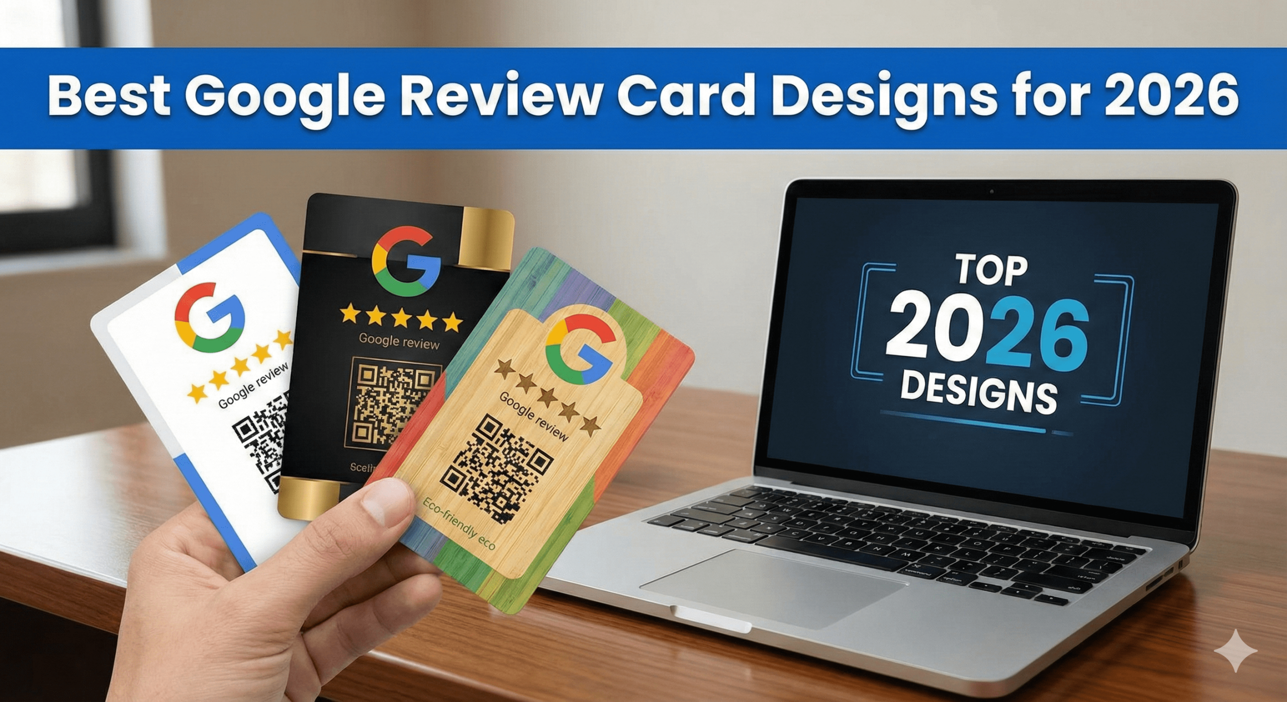
In 2026, design matters more than ever. Google Review Cards don’t fail because the technology doesn’t work — They fail because the design doesn’t invite action.
This guide breaks down the best Google Review Card designs for 2026, based on:
- Real customer behaviour
- Conversion psychology
- In-person usability
- MUVERA-aligned trust signals
- What actually gets more taps
No fluff. No “pretty for Instagram” designs. Just designs that convert into real Google Reviews.
⭐ The Core Principle of High-Converting Review Card Design
The best Google Review Card designs are instantly understandable, visually calm, and action-focused.
If someone needs to think, read too much, or ask what to do, the design has already failed.
🧠 What a Google Review Card Must Communicate in 2 Seconds
A customer should instantly understand:
- What this is
- What to do
- What happens next
The best designs achieve this without explanation.
🥇 Design #1: Minimalist “Tap to Review” Design (Top Performer)
Why it works
- Zero clutter
- Clear call-to-action
- Matches contactless behaviour
Key elements
✔ Large “Tap to Leave a Google Review” text
✔ NFC icon (universally recognised)
✔ Subtle Google branding (not overpowering)
✔ Clean background (white, black, neutral tones)
Best for
- Cafés & restaurants
- Salons & barbers
- Retail stores
- Gyms
- Clinics
👉 Verdict: Highest overall conversion rate in 2026.
🥈 Design #2: Logo-First Brand Trust Design
Why it works
- Reinforces legitimacy
- Builds confidence before action
Key elements
✔ Business logo as the focal point
✔ Small supporting CTA (“Tap to review us on Google”)
✔ Consistent brand colours
✔ Premium material finish
Best for
- Established brands
- Clinics & dentists
- Estate agents
- Hotels
- Professional services
👉 Verdict: Slightly lower conversion than minimalist, higher trust perception.
🥉 Design #3: Instructional Micro-Guide Design
Why it works
- Removes uncertainty
- Helps less tech-confident users
Key elements
✔ 2-step instruction (Tap → Review)
✔ Simple icons
✔ Large readable text
✔ No paragraphs
Best for
- Older demographics
- Clinics
- Community businesses
- Trades
👉 Verdict: Converts well where clarity matters more than aesthetics.
⭐ Design #4: Social Proof–Primed Design
Why it works
- Pre-frames trust
- Normalises review behaviour
Key elements
✔ “Trusted by 500+ customers”
✔ Star icons (without promising ratings)
✔ Subtle credibility messaging
Best for
- Competitive local markets
- Newer businesses building authority
- Hospitality
👉 Verdict: Powerful when paired with ethical wording.
❌ Designs That Perform Poorly (Avoid These)
These consistently underperform in 2026:
❌ Overcrowded text
❌ Long explanations
❌ Multiple CTAs
❌ Tiny fonts
❌ Loud gradients
❌ QR-only designs with no instructions
❌ “Please give us 5 stars” language (policy risk)
If it looks like marketing, people ignore it.
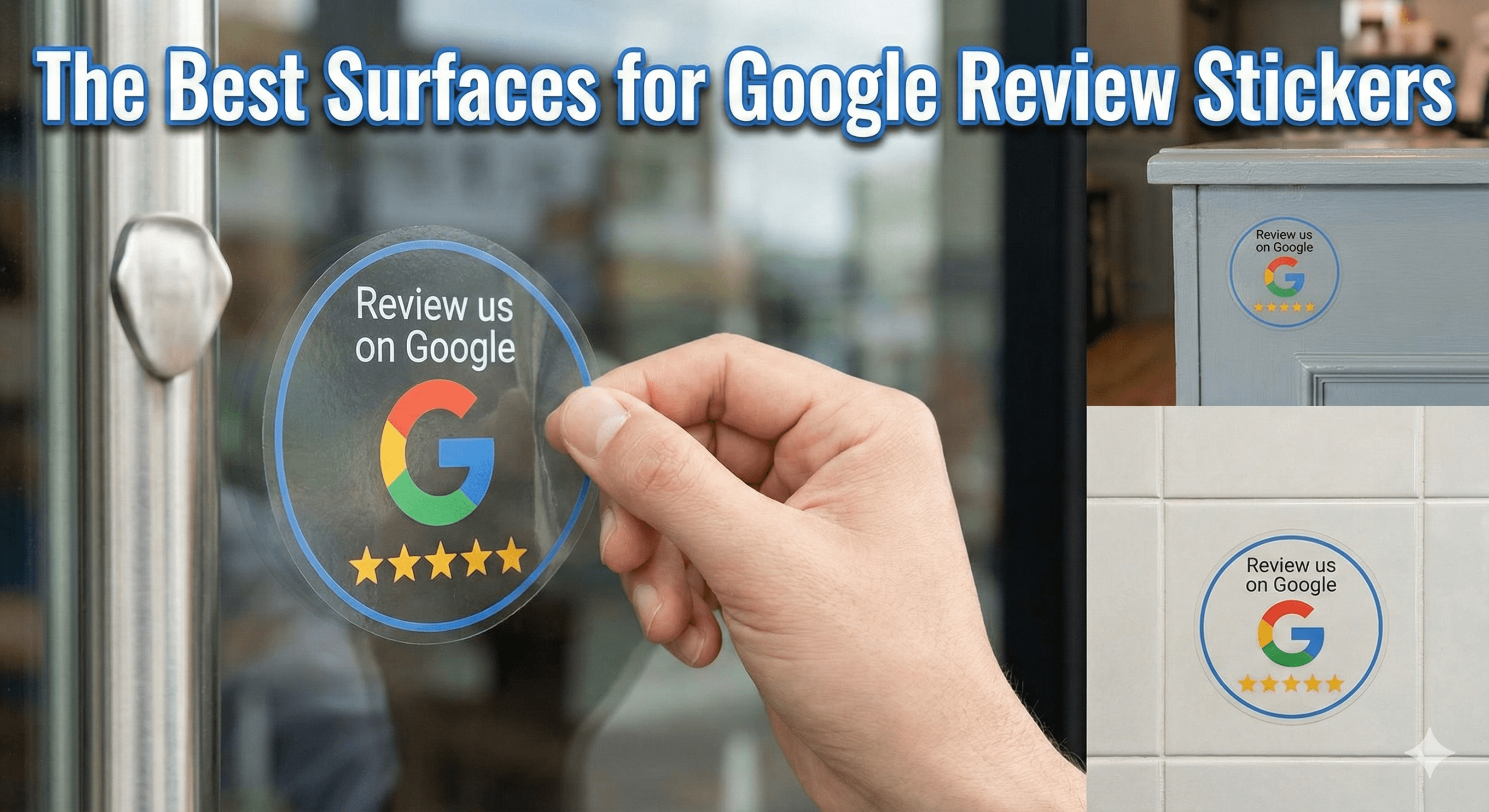
🎨 Colour & Material Trends for 2026
Best-performing colours
- White
- Matte black
- Soft neutrals
- Brand-consistent tones
Materials that convert better
- Matte plastic
- Acrylic
- Metal finishes
Glossy, cheap-feeling cards reduce trust subconsciously.
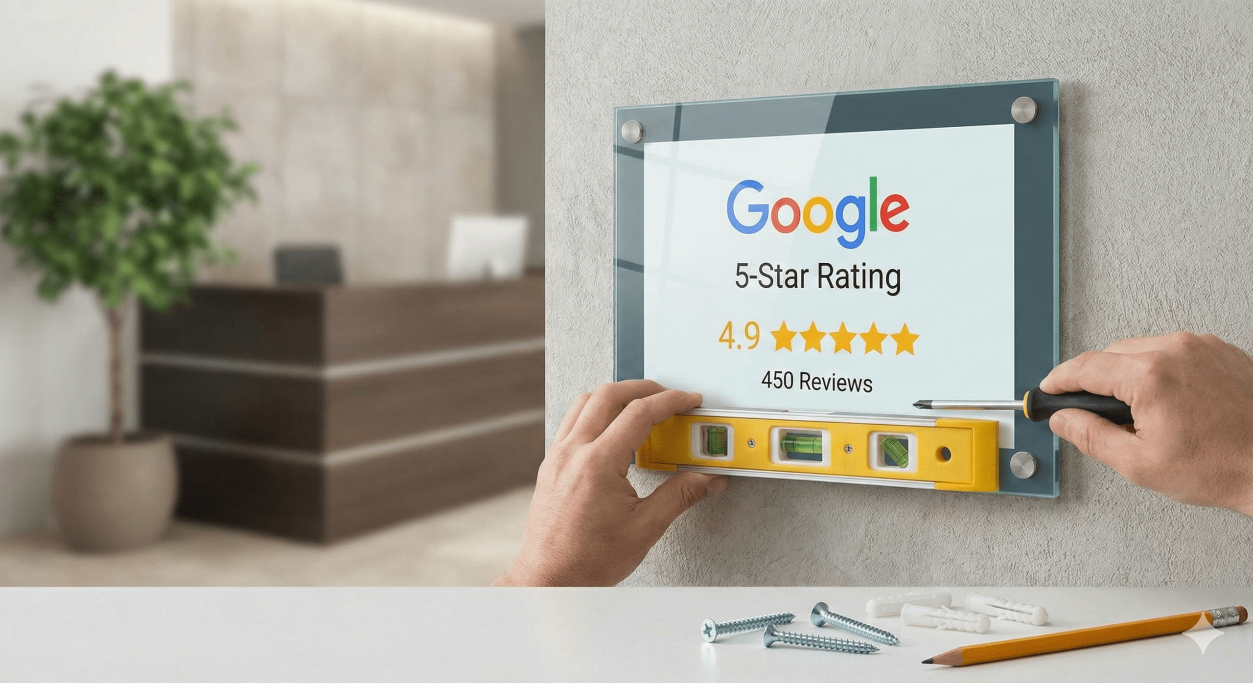
📐 Size & Layout Best Practices
✔ Credit-card size or slightly larger
✔ Rounded corners (feel familiar)
✔ Clear tap zone
✔ No edge-to-edge text
Customers should instinctively know where to tap.
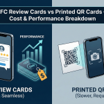
🔥 NFC + QR Hybrid Design (Best Practice)
The best designs in 2026 include:
- NFC as primary
- QR as secondary backup
- Clear hierarchy:
- “Tap your phone”
- Smaller: “Or scan QR”
This covers 100% of devices without visual clutter.
🧠 Why Design Impacts Local SEO (Indirectly)
Better design →
- More taps
- More reviews
- Better recency
- Stronger velocity
Which →
- Better Map Pack visibility
- Higher CTR
- More trust
Design doesn’t rank — behaviour does.
🧠 MUVERA Alignment Checklist (Design Edition)
High-performing designs are:
✔ Neutral in tone
✔ Not incentivised
✔ Not rating-biased
✔ Customer-initiated
✔ Simple and honest
This keeps them 100% Google-compliant.
🧠 AEO FAQ: Review Card Design
Do designs really affect review volume?
Yes — dramatically.
Is minimalist better than branded?
Usually yes, but depends on industry.
Should I include star icons?
Yes — only as neutral visual cues.
Should I mention Google?
Yes — clarity beats subtlety.
Is QR still needed?
Yes — as a backup only.
🏁 Final Verdict (Clear & Practical)
✅ The best Google Review Card designs for 2026 are:
✔ Minimal
✔ Clear
✔ Action-focused
✔ Trust-building
✔ NFC-first
✔ QR-supported
✔ Visually calm
The best design doesn’t try to sell. It simply removes hesitation. When customers understand what to do instantly, they tap — and reviews follow.